

I love Boston College. I love BC Athletics (most of the time). But I don’t love—I really don’t love—BC’s uniforms.
So, let’s make them new ones.
Am I qualified to do this? No, probably not. I have no experience in graphic design (though some friends who do were gracious enough to help out). I’m just a normal guy who loves to make content, so content I will make.
The timing for BC to update its branding and change its uniforms couldn’t be better. After Director of Athletics Brad Bates steps away from BC in June, the University will bring in a new leader with a unique vision about the future trajectory of BC Athletics. The most fitting way to mark this change behind the scenes is to make a change in front of the camera, too.
Look good, play good, right? Perhaps a new set of threads is all BC Athletics needs to shake it up on the ice, hardwood, and gridiron. So let’s get started.
The Logo
On an organizational level, the first step I’d take is to move away from the slanted “BC” logo that the Eagles have been using since 2001. To me, that logo reeks of the 1990s, when baggy shorts were in and I was just about to enter kindergarten.
Additionally, the slanted logo will always be associated with the the worst year for a Power Five athletic department since World War II. If BC really wants to put the past in the past, it makes sense to change its logo now.
I love retro looks—I think the bright colors and simple fonts of the jerseys of yesterday are beautiful. So rather than designing an entirely new set of logos in an entirely new color scheme, I think it makes most sense to switch back to the logo the Eagles used in the latter half of the 20th century.
Football
This should be the easiest fix of the three major sports. If the Eagles want to roll out a winning look for next season, just go back to the Doug Flutie-era throwbacks that the team debuted in its 2015 game against the University of Notre Dame.

The uniform is classically simple. The plain helmet is timeless, the jersey isn’t too busy, the striped undershirt is a pretty cool modernization, and the pants tie everything together.
This has to be one of the first decisions made under the new Director of Athletics. It’s a no-brainer.
Hockey
Okay, now we get to be a little more creative. Historically, BC’s hockey jerseys have always been somewhat similar. Throughout almost all of BC’s history, its hockey sweaters have said “Boston College” on the front. In addition to the gold alternate the Eagles currently sport, I could only find one example—this jersey modeled by Craig Janney from 1985—of a jersey without script on the front.
I think squeezing the full name on the front is unnecessarily wordy. Most classic hockey sweaters feature a logo rather than text. With that in mind, swap out the text for BC’s primary logo, sans eagle.
A lot of jerseys slap the secondary logo on each of the shoulders, but with numbers and stripes also on the sleeves, the secondary logo can crowd things out. To keep it simple, leave the shoulders clean and save the secondary logo for the bottom of the shorts.
The recognition of past championships on uniforms is one of my favorite features of jerseys—the NBA instituted a universal system of recognition with a gold tab on the back of the collar. In the same spirit, the five stars memorializing BC’s five championships need to remain right above the nameplate.

Basketball
Though BC has had some hockey sweaters over the past two decades that were pretty tough to swallow, I think BC basketball has made the biggest missteps in terms of its look. Some of its classic looks, like this one worn by John Bagley in the early 1980s, are incredible. This gold third jersey worn by Reggie Jackson is, uh, not great!
In the mid-2000s, BC basketball doubled down on the slanted font and new-wave design. More than anything, those jerseys were just really, really busy. It’s time for BC basketball to take a step back, strip away all the excess, and deliver a clean, classic design.

These tops use the same font as the jerseys that Dana Barros wore in the late 1980s. They’re still block letters, but not quite as large as the ones on BC’s current uniform set.
The design of the shorts might look similar to New Englanders—I borrowed pretty leniently (read: used) the design of the Boston Celtics’ shorts. BC’s latest marketing efforts have promoted the team as “Boston’s College,” so here’s their chance to showcase it. If you want to be Boston’s College, dress like Boston’s team.
One of the designs I’ve always been fascinated with was the grey throwback uniform that BC basketball wore a few years back against Syracuse University. Though I wasn’t a huge fan of it, I loved the cursive font, a nod to the Bob Carrington era in the 1970s.
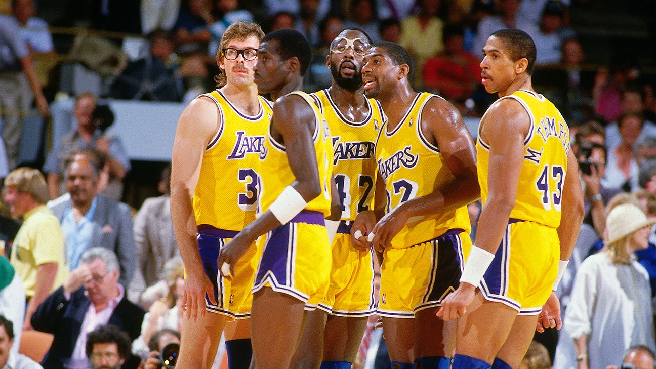
I wanted to make a third jersey for basketball, and I knew it needed to incorporate the cursive. Given that the team already had a white jersey for home and a maroon jersey for the road, this one is old-school yellow, somewhere between the Showtime Lakers and Bel-Air Academy. It’s loud, it’s unique, it’s basically everything the regular uniforms are not.

And it’s only to be broken out on the most special occasions, like the 2019 ACC Championship banner-raising ceremony or Ky Bowman jersey retirement night.
Featured Image by Meg Dolan / Heights Editor | Drew Hoo / Senior Staff


You must be logged in to post a comment.