This column is a conversation with Old Nate, a continuation of my first piece about the recent changes made to the Boston College campus and the messages those changes send. Stokes Hall is the most high-profile of these changes. Everyone and his or her mother loves it, with its overwhelming eager-to-please-ness. It’s back in the limelight again after recently winning a fifth award for excellence in design. The front page of Agora Portal is beaming with pride that the experts anointed Stokes’ beauty. But hey, this country was founded on the sweeping rejection of received wisdom, so with that in mind:
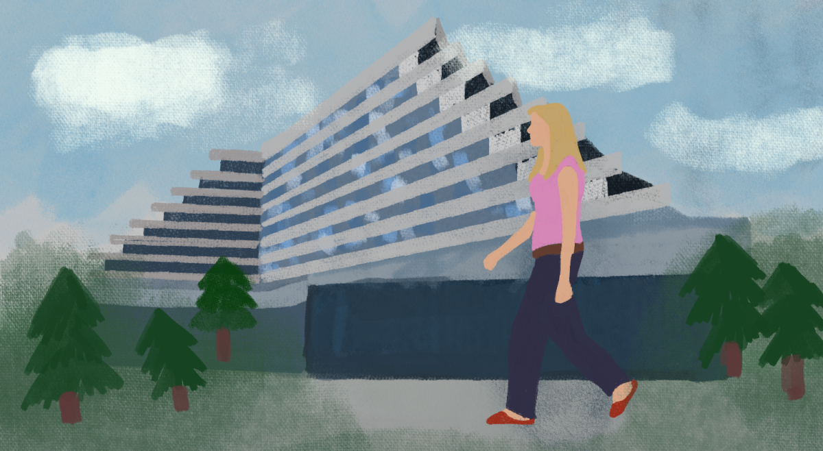
Stokes Hall is ugly, and I reject any argument made towards its beauty or its belonging on this campus. Whew. That was fun. Contrarianism feels cleansing.
That’s a bit much, Nate. Cool your jets. Stokes is such a pleasant building. All it wants to do is look nice and be a part of BC campus. It even tries to fit in by looking like the marquee old buildings around it. But the awful truth is that, try as they might, no one can make a new old building. The closest thing anyone can manage is making something new that vaguely resembles the old building, but the plastered-on old aesthetic is only skin-deep, made with new materials and new building techniques. Stokes and the buildings like it never truly feel old-the best they can manage is a Disneyland kind of tack.
Curiously, inside Stokes any pretensions of oldness are swiftly dispatched with. The hallways have the echo chamber polished sterility of your ritzier bathrooms. The designers also apparently saw fit to include several faux-gold elevators. Oh, to be a fly on the wall for the architecture firm’s meeting that day. “You know what would make this academic building prettier, Tom? Four of those gold elevators we just installed in that three-and-a-half-star Vegas hotel!” “That’s a great idea, Darryl! We’ve got an award-winner on our hands!”
Big deal, Nate. This is just a roundabout way of you saying you don’t like how it looks. You probably think O’Neill Library is better architecture (I do). But the ramifications of Stokes extend far beyond my taste. Stokes sends several of the wrong messages that a Jesuit, Catholic institution dragging itself towards the 21st century should send. It commits several cardinal sins, all by virtue of its aspiration towards beauty and the sense that it “belongs” at BC.
Stokes offers up no conversation with the other pieces of architecture around it. Making a building that offers no conversation with its surroundings flies totally counter to the principles of higher education. A university campus ought to incorporate unique designs from different time periods to document and honor the intellectual tradition. A university is always updating and changing what it knows. It doesn’t just teach geocentrism and paint without three-dimensional perspective over and over again. Stokes, by virtue of its young-old-ness, is the received wisdom of the past without its inherent wisdom. It’s just the reception.
The message BC sends with Stokes is that it is not interested in honoring the intellectual tradition. Stokes indicates that BC cares more about imprinting and exhibiting its brand, and maintaining total control over how that brand looks. The architectural inbreeding of aping the nearby buildings says, “We have our thing. This is what we do. And it doesn’t change. Not after a hundred and fifty years. Anything different has no place on this campus. Anything modern has no place on this campus. Except gold elevators. Four of those, please.”
This should be unsettling for anyone who thinks BC needs to change its attitudes or policies. Given the uproar a year ago about the university’s stance on contraceptives, with many labeling the University “backward,” this architectural worship of the past indicates that change is unlikely any time soon. If you’re not a BC kid, don’t bother trying to feel welcome here. There’s a visual ideal to aspire to. Stokes is the preppy white kid. Stokes is the grand bombastic metaphor for how this University regularly prizes homogeneity, and for how often it carelessly treads on creativity and diversity despite its half-hearted claims to the contrary.
Editor’s Note: The views presented in this column are those of the author alone and do not represent the views of The Heights.